journal | team | miscellany | home
An Interview with Anish Soni
Deconstructing (A)Symmetry
Augustine George & Aswin Prasanth
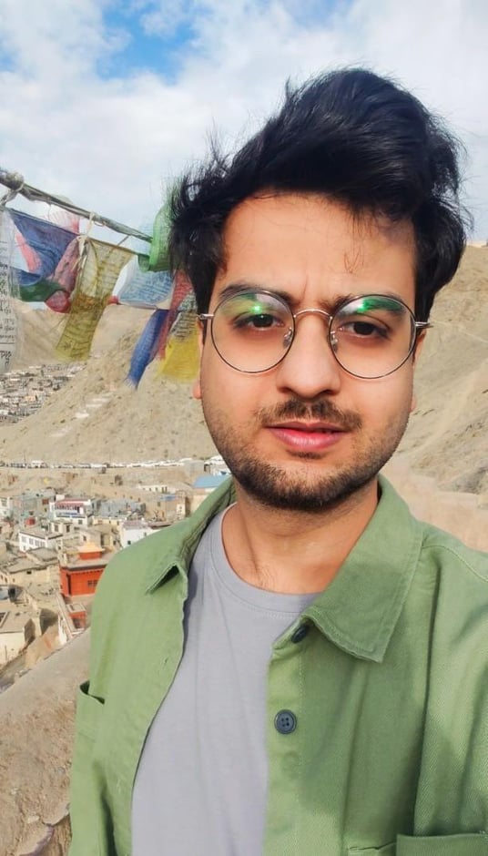
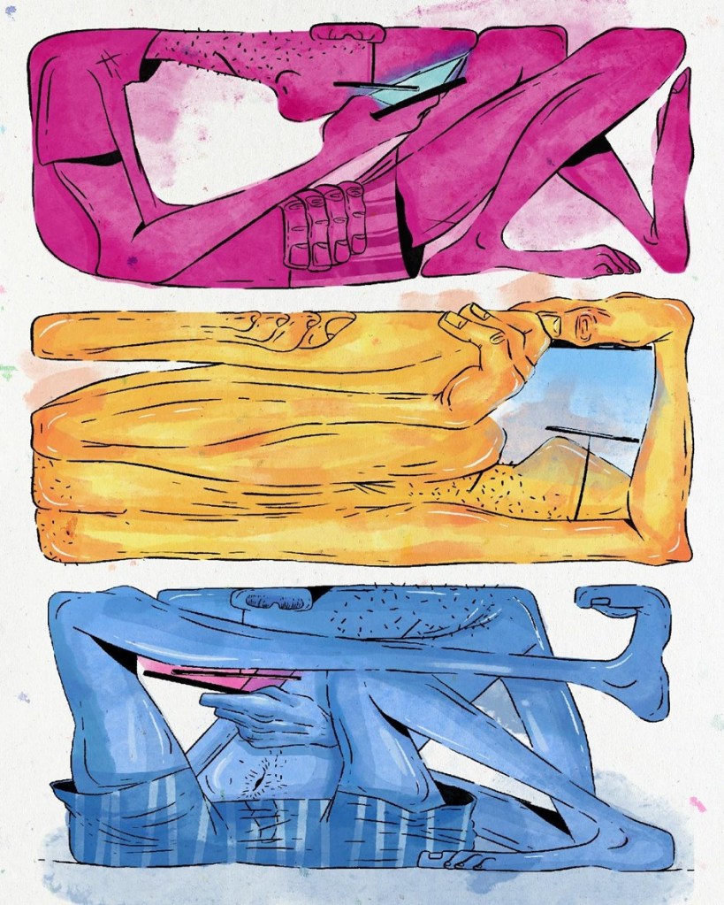
Anish Soni is a Kyoorius award-winning illustrator based out of Punjab, India. Soni’s works are marked by geometric shapes and minimal colors. Among his artistic inspirations are Mughal miniature painting, Picasso’s Cubism, and Japanese woodblock prints. Soni has a penchant for incorporating the visual spectacles of cinema into his work. His works have received wide acclaim, including recognition from the World Wildlife Fund (WWF). In this interview, Augustine George and Aswin Prasanth engage with Soni on his inspirations, passions and artistic methods.
As an illustrator who works with digital platforms, how do you view art in the digital age?
In the digital age, art can be viewed by everyone and anyone at their convenience. Similarly, artists can now upload their pieces online, which can be viewed by millions of people all over the globe. It connects people who were never engaged before and is encouraging more people to become interested in the world of art. Ultimately, the digital age has expanded the bounds of creativity and given power, and artistic license to everyone.
There are growing concerns about the role of artists in the age of mass production and instant replication. Do you think that the authenticity of art and originality of the artist are under threat in the digital age?
Originality never diminishes; it only gets enhanced. The risk of plagiarism has existed in every field, even before the digital age. But, a keen eye will always appreciate authentic work. Mass production of artwork aids in expanding an artist’s network to spread its message throughout the world. So, I believe the digital era has been a boon to artists.
Cubist art is noted for its asymmetrical geometrical shapes. How has it influenced your artistic style?
One thing I learned at my art school was that if we want to create anything, we need to break that complex object into simpler parts; whether it is the anatomy or still life. I was fascinated with this lesson and have been following this advice since then.
Shapes play an important role in the creation of art. They help to create complex drawings and affect the composition. By organizing geometric and organic shapes, we can sketch anything. Even complicated objects become easy to draw when we isolate basic geometric and organic shapes. You can turn a shape into the illusion of form by adding value and you can simplify a form from life into a shape.
Mughal miniature paintings are celebrated for their meticulous focus on outlining, colouring, and calligraphy. Could you elaborate on how the attention to details of Mughal miniature paintings are incorporated into your works?
Mughal miniatures were small, brightly colored, and highly detailed paintings mostly used to illustrate manuscripts and art books. Despite their tiny sizes, they are incredibly precise, with some lines painted using brushes composed of a single hair.
I tried to put this courtly sophistication to appear highly stylized. Certain attributes of artworks that flourished during the Mughal Empire define my style. The characters are fixed, but the hues of the artworks are vibrant and full of life.
You have a fascination for Japanese woodblock printing. What are its implications on your artworks?
Japanese woodblock paintings are generally known as Ukiyo-e. They are appreciated for their bright colors and decorativeness. Their images frequently depict a narrative which include animals, birds, landscapes and people from the lower social classes like courtesans, sumo wrestlers, and Kabuki actors. The techniques they use are interesting. I especially like the expressions of the characters depicted in them. It also shows their cultural diversity and richness.
Your works feature on numerous product advertisements, including OYO (On Your Own), a popular Indian online hotels and homes services. What details do you foreground while creating illustrations for commercial advertisements?
Answers to three key questions are necessary while starting to work on any commercial marketing material: What’s the topic? Who’s your audience? (Target group impacts the way you design or choose colors); and What’s the end purpose of your marketing campaign? If we put together the answers to these questions, it becomes convenient to kick off any project.
You are a recipient of the Kyoorius Creative Award. How has the award shaped your subsequent artistic productions?
Recognition of your work definitely boosts your morale. The award was really special for me. It gave me a sense of confidence to strive in this highly competitive domain. A lot of credit goes to my peers and seniors who guided me throughout the project.
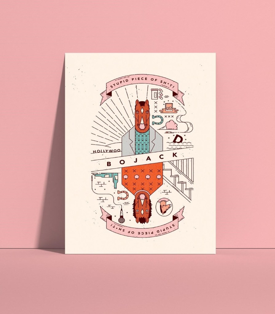
The cult status of movies and web series has opened up many online and digital platforms for discussion and interpretation. How do you engage with such pop-culture material and give them your unique reading?
Cinema had a major role, right from the beginning, on my professional as well as personal work. Components like lighting, composition, and characters in my art were inspired from movies. I am trying to reciprocate towards the art community through my work.
Your illustration titled Rino won the second prize on World Rhino Day hosted by WWF (World Wildlife Fund). Could you elaborate on the illustration, the event, and your interest in wildlife?
I’m interested in wildlife because every animal has a unique body and bone structure. They are versatile and too elaborate. Constructing them in a minimal art form using cubism was challenging for me. I was drawn towards this type of art form. I wanted to explore cubism, so I chose wildlife. Also, the need for connection with the wild is part of human nature; they always fascinate me.
Could you detail for our readers your ongoing project on creating a deck of cards in miniature painting style?
I had worked previously on creating similar content, where I used a detailed approach. On this occasion, I wanted to create something with a minimal amount of details and colors. I am trying to build a set of all face cards in which the face becomes the main focus along with a slight bend towards the design as well as the background.
▪
Check out Anish Soni’s art on Bēhance, and follow on Instagram.
▪ ▪ ▪
Augustine George is a research scholar in English at Amrita School of Arts and Sciences, India. His interviews have been published in the Journal of Graphic Novels and Comics (Routledge) and Rain Taxi. Augustine can be reached at roshonline12@gmail.com.
Aswin Prasanth is a research scholar in English at Amrita School of Arts and Sciences, India. He is the Academic Essay Editor of Panorama: The Journal of Intelligent Travel and an editor at Twelve Winters Journal. His articles, columns, reviews and interviews have appeared in the Journal of Graphic Novels and Comics (Routledge), The Poet, The Cue, Rain Taxi, Mathrubhumi, The New Indian Express, and others. Aswin can be reached at aswinprasanth3@gmail.com.
journal | team | miscellany | home


